
作者:Emma Carter · 2026年9月20日
Menu Color Psychology: How Colors Drive Orders
Color is the first thing guests read on a menu — before the dish names, before the prices.
And the science here is more interesting than the "red makes people hungry" folklore: color works on menus because it sets expectations about how your food will taste. Used deliberately, that's an edge.
Used carelessly, it's a readability problem with a side of mixed signals. Here's what the research actually supports, and how to build a menu palette that helps you sell.
Key takeaways
- Color works by setting taste expectations — peer-reviewed, not folklore.
- One accent, 60-30-10, contrast first: restraint is the strategy.
- The palette must match the plate — mismatched color sets up a disappointed bite.
- Test on the phone before the printer; screens shift colors.
Does menu color psychology really work?
Yes — but through a specific mechanism, and it's worth knowing exactly which one.
In a peer-reviewed review of the crossmodal research, Oxford's experimental psychology team put it plainly: "Colour is the single most important product-intrinsic sensory cue when it comes to setting people's expectations regarding the likely taste and flavour of food and drink" (flavourjournal.biomedcentral.com).
Color doesn't hypnotize anyone into ordering; it tells the guest's brain what your food will taste like before the first bite.
The same review carries the warning most color-psychology posts skip: when color doesn't match taste, the result is "a negatively valenced disconfirmation of expectation" — the guest expected one thing, got another, and liked it less.
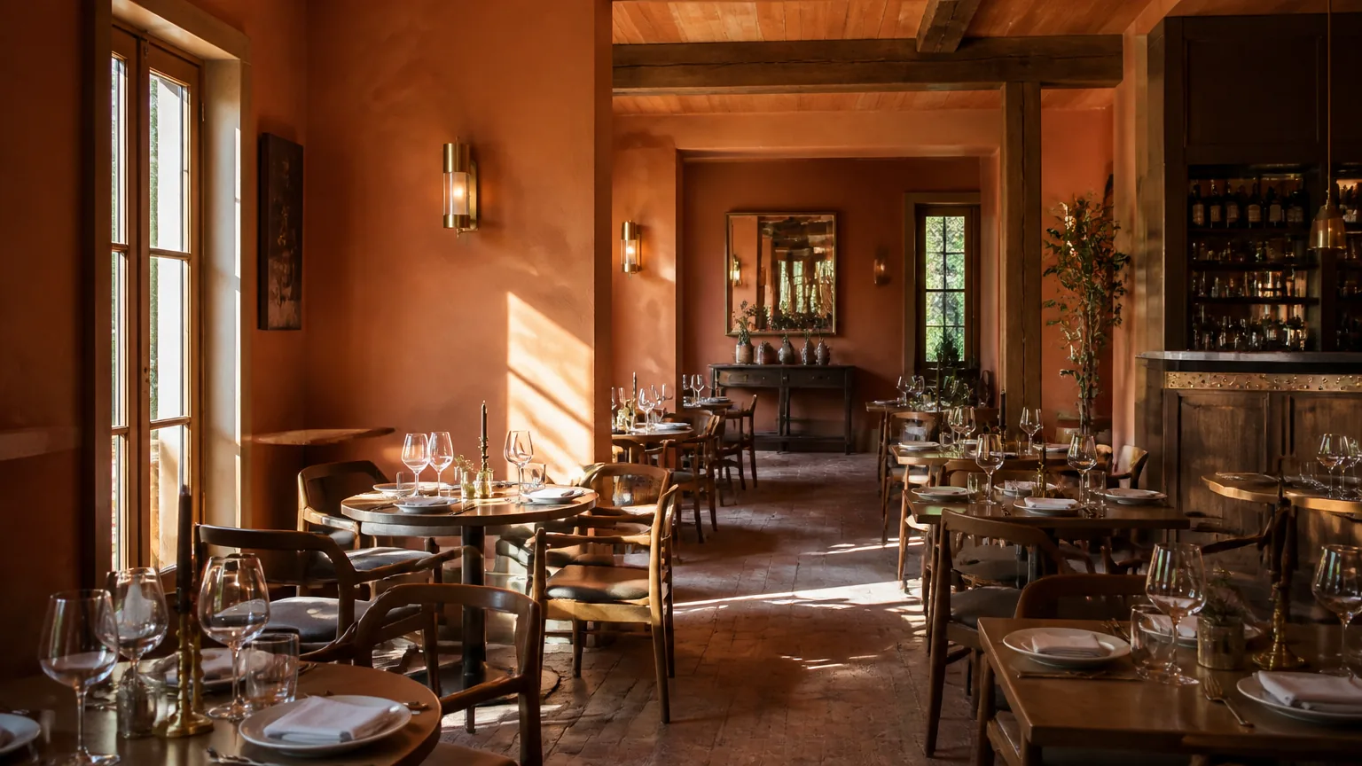
On a menu, that means your palette is making a promise about the plate. A dusty-rose pastel scheme quietly promises a different restaurant than charcoal and brass.
What do menu colors communicate?
Color meanings are learned associations, not universal laws — they vary by culture and context, which is why the responsible version of this list is about tendencies:
- Red and orange — energy, warmth, appetite context. The classic fast-food pairing for a reason, but in a full-service room it reads fast and casual; used sparingly (an accent, a highlight) it draws the eye without changing the room's temperature.
- Green — freshness, health, provenance. The default language of salads, vegetables and the word "local." Deep greens also read as heritage and calm in full-service settings.
- Brown, terracotta, wood tones — comfort, roastiness, rustic cooking. The palette of bakeries, smokehouses and everywhere bread is a feature.
- Black and charcoal — premium and modern, especially against gold, cream or a photograph. The standard for steakhouse and cocktail menus; also the highest-risk background for print contrast (more below).
- Cream, ivory, warm whites — calm, space, craftsmanship. The quiet luxury option: it makes type look expensive and lets food photos carry the color.
- Blue — the honest exception. Blue rarely appears naturally in cooked food, so it sets weak appetite expectations; it works as a brand accent (a seafood room, a morning café) rather than the menu's main voice.
One discipline note from the research side: color highlights don't create attention out of nowhere.
Eye-tracking work found guests read menus "sequentially like a book," with "no evidence of menu sweet spots" (eurekalert.org) — so a colored box helps a dish only if the guest is already reading that part of the page.
Color amplifies structure; it can't replace it.
How do you choose a menu color palette?
Five steps, in order — the same order a designer would bill you for:
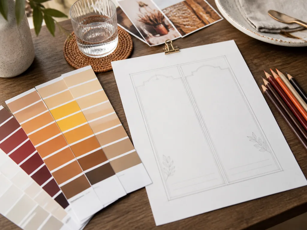
- Start from the room, not the Pinterest board. Your palette should echo something real: the tile, the woodwork, the neon in the window. Guests feel coherence even when they can't name it.
- Pick one accent, not a family. The single most profitable color decision on a menu is choosing what not to color. One accent, reserved for category names and the dishes you're pushing, beats a rainbow every time — the same restraint logic that makes bare-numeral prices work, where the measured version outperformed dollar signs by about 8% in a Cornell field study (news.cornell.edu).
- Use the 60-30-10 split. Roughly 60% of the page in your neutral (cream, charcoal), 30% in a supporting tone, 10% in the accent. Menus fail visually when the accent becomes 40%.
- Contrast first, mood second. Dark type on a light ground or the reverse, at real print/screen contrast — the most beautiful palette in the world loses to a menu nobody can read over candlelight. Check it on your actual table, under your actual lights.
- Test on the phone. Most guests meet the menu as a scan or a link now. Colors shift on screens — what's sage on paper can be neon on a cheap display — so look at the digital version before committing to print.
What are the most common color mistakes on menus?
- The accent epidemic. Four highlight colors means zero highlights. If everything pops, nothing does.
- Decorative color on body text. Grey-on-black "artistic" type, warm-brown prices on cream — guests squint, then stop. Body text earns one color: high contrast.
- A palette that fights the food photos. If your dishes are red-sauce and golden-crust, a cyan menu is at war with them. The background should make the photos the most colorful thing on the page.
- Color promises the kitchen can't keep. Neon-fresh greens and candy-red accents set expectations the plate won't match — that's the disconfirmation trap from the research above. Your palette should taste like your cooking.
- Trend colors with a short shelf life. The color of the moment dates a printed menu within a year; classics date in a decade. Choose accordingly.
How do you apply a palette without a designer?
Layout templates encode these disciplines for you: a neutral ground, one accent slot, tested contrast, and photo-forward sections where color comes from the food itself.
MenuLolo's three menu layouts in the menu maker work this way — pick the layout, set your brand color in the accent slot, and the palette logic is inherited rather than improvised.
Our menu design tips guide covers the full system, and the typography half of the equation lives in best fonts for menus.
If you want the palette tuned to photography, our AI food photo editor offers background and tone options — warm woods, black slate, white marble — so the images and the page share one temperature.
FAQ
What color makes people order more food?
No single color is a purchase button — the research supports color setting taste expectations, not triggering hunger reflexes. Reds and oranges are the classic appetite-adjacent accents; cream and charcoal read premium; the winning palette is the one that matches your food and stays readable.
Is blue really bad for restaurants?
Blue is weak at setting appetite expectations because it rarely appears in cooked food — the honest reason it's rare on menus. It still works as a brand color for seafood rooms and cafés, just not as the color promising flavor.
What's the best background color for a menu?
The one that makes your type and photos most readable: cream and warm whites for warmth and photos, charcoal and black for premium rooms with bright type. Contrast beats mood when they conflict.
How many colors should a menu use?
Three roles: one neutral ground, one supporting tone, one accent — roughly 60-30-10. More colors dilute every highlight and slow the read.
Does menu color psychology apply to digital menus?
Even more directly — screens shift colors, most guests meet the menu on a phone, and a dark-mode-friendly palette survives both. Test the digital version under real lighting before print, and update colors without reprinting when you get them wrong.
Quick recap
- Color works by setting taste expectations — peer-reviewed, not folklore (the mechanism).
- Meanings are tendencies: red/orange appetite context, green freshness, brown comfort, black premium, blue the exception.
- One accent, 60-30-10, contrast first — restraint is the strategy.
- The palette must match the plate: mismatched color sets up a disappointed bite.
- Templates inherit the discipline; test on the phone before the printer.
Color is one lever among many — for the full menu system, start with how to make a restaurant menu.