
作者:Sarah Mitchell · 2026年9月18日
QR Menu Design Best Practices for Restaurants
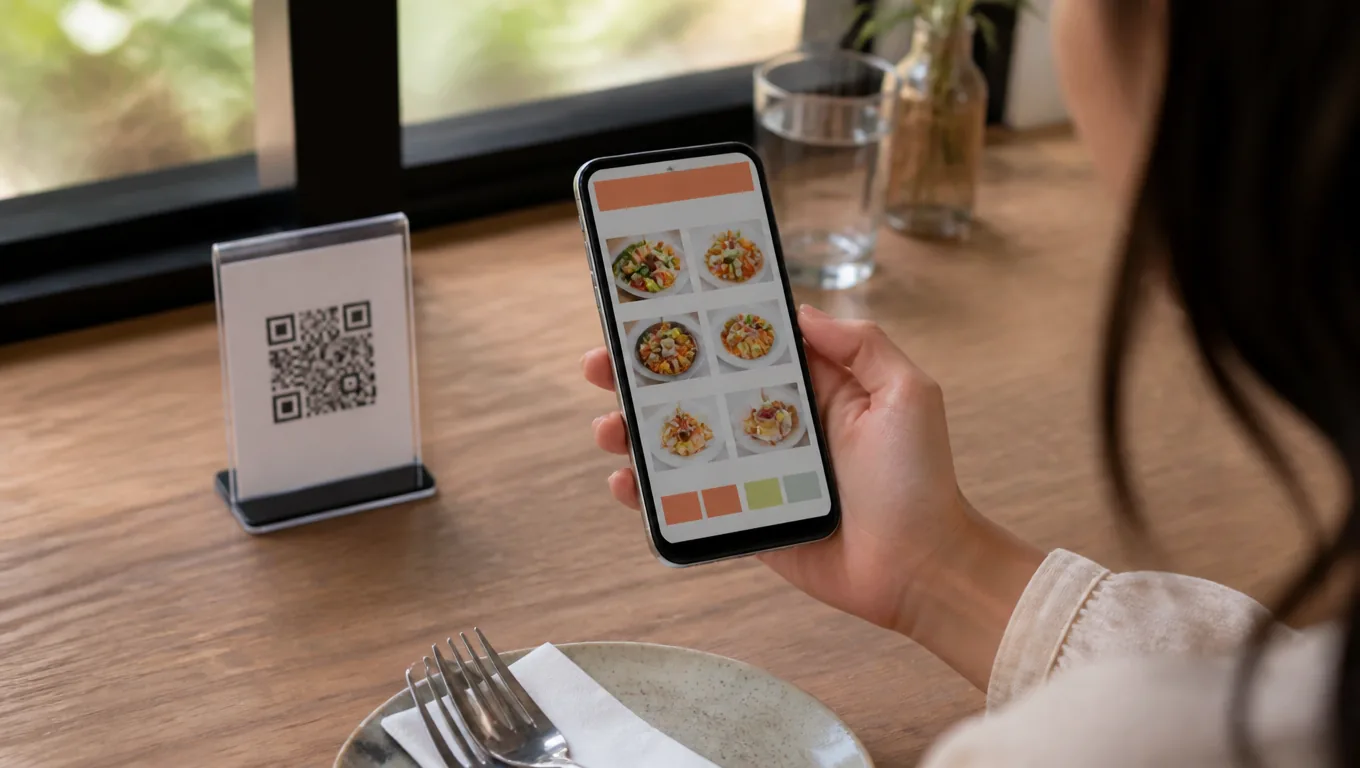
A QR menu lives or dies in the first five seconds: scan, load, first category. Guests have already decided whether your QR menu design works before they read a single dish name.
The habits outlived the pandemic — surveys reported in 2026 find about 71% of consumers consider QR codes helpful in daily life — so the bar is no longer "has a QR code" but "is pleasant to use". These best practices cover the page, the photos, and the printed card.
Key takeaways
- QR menu design lives or dies in five seconds: scan, load, first category.
- One column, six to eight categories, bestsellers up top.
- Three honest photos, bare-numeral prices, one-line descriptions.
- Print with a four-module quiet zone and scan-test at table distance; keep a paper fallback.
On the page: speed first
Load under two seconds. A QR menu that spins loses guests before the first category. Skip heavy hero videos and huge image files; compress photos the way a purpose-built builder does automatically.
One column, big tap targets. Phone screens are thumb territory. Categories and items should be tappable without pinching, and prices should never sit in side-by-side columns that force horizontal scrolling — the most common QR menu design mistake on converted print menus.
Categories at the top, six to eight max. Two taps to any dish is the rule. Long single-scroll menus bury your bestsellers below the fold — the same sequential-reading logic that governs all menu design.
Front-load the winners. The first screen-height is prime shelf space. Your three most profitable, easiest-to-love dishes belong there, not the safe crowd-pleasers you already sell by default.
Photos: few, honest, bright
Three excellent dish photos outsell a photo on every item. A wall of inconsistent phone shots reads as a cafeteria; three clean ones read as kitchen pride.
Shoot by a window and fix the rest in editing — our phone food photography guide covers the three angles, and an AI food photo editor fixes light and color in one pass.
On delivery platforms the same photos do double duty: DoorDash's merchant guidance requires clear, well-lit photos without text overlays, on a neutral background.
Prices and descriptions are where good QR menu design gets quiet about selling. Present prices as bare numerals and let them follow the description — Cornell's field research found diners spent about 8% more per check without currency symbols. Keep descriptions to one sensory line each; full formulas in our guide to menu descriptions that sell.
On the card: the print half of QR menu design
Respect the quiet zone. Denso Wave — the company that invented the QR code — specifies that a code "requires a four-module wide margin at all sides" with nothing printed in it. Most scan failures trace back to ignoring this blank border.
Print big enough, test at table distance. Two by two centimeters is the floor; 40-60 cm is your test distance, under your actual lighting.
Never let the URL change. Printed codes point at one address forever. The card stays valid because the page behind it updates — that is the entire advantage of a web-based QR menu over a PDF.
Add two words of instruction. "Scan for menu" measurably reduces hesitation, especially with older guests.
Accessibility: design for every guest
- High contrast. Dark text on light ground; never light gray on white.
- Big body text. 16 px minimum — the over-45 crowd is a large share of paying guests.
- One printed fallback. Keep two paper menus behind the bar for guests who ask. The web menu is primary, not exclusive.
The five-minute QR menu design checklist
- Page loads under two seconds on cellular.
- Six to eight categories, tappable, first screen shows your bestsellers.
- Three strong photos, honest and consistent.
- Bare-numeral prices, one-line descriptions.
- Printed cards: quiet zone respected, scan-tested, "Scan for menu" caption.
A purpose-built QR menu builder handles most of this by default — MenuLolo's templates ship with the sizes, compression and print-ready codes described above. For the full build walkthrough, see how to make a QR code menu.
Two QR menu design anti-patterns to avoid
The mini-PDF. Shrinking a print menu into a web page keeps every problem — tiny fonts, two columns, no tap targets — and adds a slow load. Redesign for the phone instead; the print card stays for the table.
The novelty redirect. Codes that open a landing page with music, animations, or a "click here for menu" step. Every extra step between the camera and the first dish costs guests — the QR menu design rule is: scan, land on the menu, done.
FAQ
What makes a good QR menu design? Three things: it loads fast, it is readable on one thumb, and it puts your best dishes in the first screen. Good QR menu design is invisible — guests notice the food, not the interface.
How big should a QR code be on a table card? At least 2 × 2 cm with the four-module quiet zone kept blank around it, then scan-tested from real table distance (40-60 cm) under your lighting. If it fails twice, print bigger.
Should a QR menu replace paper entirely? Make the web menu primary and keep one or two paper menus as fallback for guests who ask. Most guests scan happily; the fallback costs you nothing once printed.
Why is my QR menu slow to load? Usually oversized photos. Re-compress images for the web, avoid autoplay media, and use a builder that compresses automatically — five seconds of spinning is enough for a guest to give up.
Quick recap
- QR menu design lives or dies in five seconds: scan, load, first category.
- One column, six to eight categories, bestsellers up top.
- Three honest photos; bare-numeral prices; one-line descriptions.
- Printed cards: four-module quiet zone, scan-tested at table distance.
- Keep a paper fallback; make the web menu primary.
That is the whole playbook. The rest is repetition and a seasonal refresh.