
著者:Sarah Mitchell · 2026年9月20日
How to Make a Restaurant Menu, Step by Step
A good restaurant menu is not a list of dishes — it's the one piece of marketing every single guest reads. This guide walks through how to make one from scratch: the structure that decides what guests see first, the descriptions that sell, the pricing presentation that quietly lifts checks, the photos that carry it, and the publishing step most guides skip.
Key takeaways
- Build in order: structure, dishes, descriptions, pricing, photos, design.
- Guests read menus like a book — order is strategy; corners aren't magic.
- Bare-numeral prices beat dollar signs by about 8% in a Cornell field study.
- Publish a live version and set the update rule the day the menu goes up.
What makes a restaurant menu work?
Two things, and neither is decoration. First, structure: a menu is read top to bottom like a page, and the categories, item order and descriptions either guide that read or fight it. Second, discipline: consistent typography, honest prices, one visual language. Researchers who study menu design call the profit-oriented version of this menu engineering — "the design of a menu to maximize restaurant profits" (wikipedia.org) — and nearly all of it is discipline, not talent.
You'll make roughly a dozen decisions below. Take them in order and the menu assembles itself.
Step 1: Define the menu's job before you open a design tool
Menus have jobs, and the job changes the build. A dinner menu sells high-margin mains; a lunch menu optimizes speed; a drinks menu up-sells the pairings. Write one sentence — "this menu exists to sell ___" — and keep it open while you work. Every later decision gets checked against it.
Also decide the format early: a printed card, a QR code menu guests scan at the table, or both. Most restaurants now do both, which changes Step 5.
Step 2: Set the categories guests actually navigate by
Categories are the menu's table of contents, and guests use them to skip to what they want:
- Lead with what guests scan for. Starters, Mains, Sides, Desserts, Drinks — in the order guests actually decide, not the order the kitchen cooks.
- Keep the count tight. Six to eight categories covers most menus; more turns scanning into work.
- Name like a guest, not a chef. "Small plates" beats "Époisses classification" — category names are navigation, not branding.
- Order for margins. Whatever your menu exists to sell (Step 1) gets the first, fully-read slot in each category.
One myth to retire: the "sweet spot" — the belief that the upper-right corner of a menu draws special attention. An eye-tracking study at San Francisco State found customers read menus "sequentially like a book" and found "no evidence of menu sweet spots" (eurekalert.org). Order matters; magic corners don't.
Step 3: Choose dishes like an editor
Restaurants over-stuff menus because deleting a dish feels like deleting an option. Guests experience it as noise. For each category, keep the dishes that do one of three jobs: sell strongly, sell at high margin, or make the menu look complete. Cut the rest — a tight menu reads faster, wastes less food, and makes every remaining dish more visible.
A worked example: a bistro with twelve mains runs the numbers and finds four of them sell fewer than three orders a week, share ingredients with nothing else, and haven't been photographed. Cutting those four leaves eight mains — each now on a shorter page, ordered more often per dish, with a prep list the kitchen can execute on a Saturday rush. The menu didn't get smaller; it got sharper. The ingredients from the cut dishes often reappear as a special, which is where one-off items belong anyway.
Step 4: Write descriptions that do the selling
A description's job is to move the dish from "mushroom risotto" to something the guest can taste while reading. The pattern that works:
- Lead with the ingredient guests value. "Hand-cut tagliatelle," not "Our famous pasta."
- Say how it's cooked, in sensory words. "Slow-braised," "charred," "folded" — verbs that imply care.
- Stop at one line. Long descriptions bury the dish name and slow the whole menu.
If writing thirty of these sounds heavy, AI menu tools draft them from your ingredient lists — our guide to menu descriptions that sell covers the full method, including the honesty check every AI draft needs before it goes live.
Step 5: How should you price a menu?
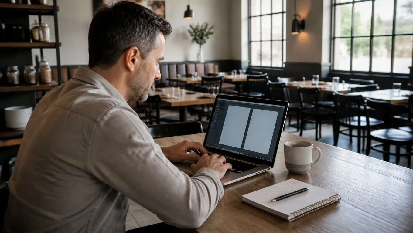
How a price looks changes what guests spend. The cleanest evidence: in a Cornell field study, diners in an upscale-casual restaurant spent an average of $5.55 more — about 8% — when the menu showed bare numerals instead of dollar signs (news.cornell.edu). The dollar symbol reminds people of "the pain of paying"; removing it lets the food lead.
Three rules that follow from the research:
- Drop the currency symbols. "12" not "$12" — on print and on screen.
- Skip the dotted leader lines that drag the eye to the price column.
- Anchor deliberately. One high-priced dish makes its neighbors feel reasonable — that's not a trick, it's how comparisons work.
Full pricing strategy — cost floors, margin targets, the math — lives in our menu pricing strategies guide.
Step 6: Add photos where they earn their place
Photos sell — delivery platforms confirm that menus with images get "more monthly sales than restaurants without images" (merchants.doordash.com). But they're a spotlight, not wallpaper: photo every dish in one or two hero categories, keep the rest text, and never mix phone snaps with styled shots. If your shots need help, our free AI food photo editor relights and cleans them in minutes.
Step 7: Design it — or borrow discipline that already works
This is the step where menus go to die in design tools. The layout needs: one serif or one sans family in two weights, a single accent color, consistent spacing between items, and prices aligned to the dish — nothing else. That's the entire design brief, and it's exactly what ready-made layouts encode. MenuLolo's three menu layouts apply that discipline automatically; you supply dishes and photos, the template supplies the typographic rules. Our best fonts for menus guide covers pairings if you build from scratch.
Color deserves one deliberate choice, not a palette. Pick a single accent — your brand color or one drawn from the room itself (the upholstery, the tile) — and restrict it to section names and the dishes you're promoting. When every line is a different color, no line is; when one is, the guest's eye lands exactly where you want it. If you want the full tour, our menu color psychology guide covers how color choices nudge appetite and orders.
What should the menu look like on a phone?
Assume the first read happens on a phone — most guests meet your menu as a link or a scan before they ever sit down. Three checks, done on your actual phone:
- Thumb test: categories should be reachable without two-handed zooming; six to eight tabs beat one long scroll.
- Font floor: dish names and prices readable at arm's length — if you squint, so do guests over 45.
- Load speed: the menu should open on cellular before the table gets impatient. Heavy homepages wrapped around menus cost orders.
A menu that fails the phone check fails the dinner test too, because print inherits the same hierarchy. Fix the small screen first; the paper version is the easy reprint.
Step 8: Publish, print, and plan for change
A menu isn't finished when it looks good — it's finished when it's live and changeable:
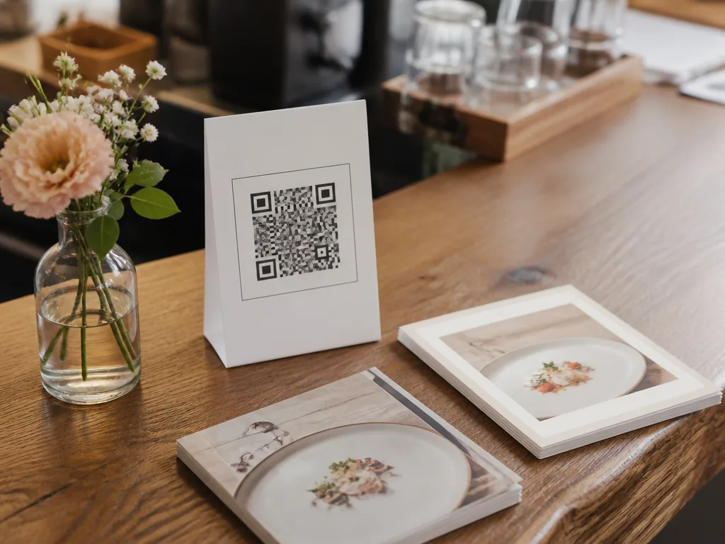
- Publish the web version so guests can find it from Google, your socials and a QR code on the table.
- Print the table version only where print earns its keep (drink cards, counter boards).
- Set the update rule: prices and sold-outs change the day they change. On a live menu this takes seconds; on paper it means a reprint run.
- Review quarterly: kill the dish nobody orders, promote the dish you want to sell.
How long does it take to make a menu?
First time, with a builder and a dish list ready: an evening. The typing and photo collection take longer than the design — which is the whole argument for templates. A re-check of these steps on a seasonal refresh should take under an hour.
FAQ
How do I make a restaurant menu for free?
Use a free menu builder: type your dishes into a ready layout, upload photos, and preview the web version at no cost.
MenuLolo's free tier covers one menu with five dishes — publishing it for guests needs a Starter or Pro plan, and printing costs nothing if you keep the design digital-first.
How many items should a restaurant menu have?
Six to eight categories with five to eight items each covers most independent restaurants. Beyond that, you're adding choice, not sales — guests read faster with fewer options.
Should I hire a designer for my menu?
Only if your brand needs something templates can't express. For most independent restaurants, a disciplined template looks more professional than a from-scratch design by a non-designer.
What's the biggest mistake people make when creating a menu?
Designing before deciding. Picking fonts first guarantees a pretty menu that doesn't sell; the structure, descriptions and pricing come first — the design encodes them.
How often should I update my menu?
Prices and availability: the day they change, on a live menu. Full concept: quarterly, with a dish-level performance review each time.
Can I just make a menu in Word or Canva?
You can — a document gets the words down. What a template-based menu maker adds is the live part: the same content published as a web page guests can open, a QR code that always shows the current version, and edits that take seconds instead of a redesign.
Start in whatever tool you like; just move it somewhere updateable before you print.
Short on time? An AI menu generator can turn your dish list into a polished first draft in minutes — then apply the steps above to sharpen it.
Quick recap
- Define the menu's job, then build structure → dishes → descriptions → pricing → photos → design.
- Guests read menus like a book — order is strategy, corners aren't magic.
- Bare-numeral prices measurably outperform dollar signs; anchor with one high ticket.
- Photos in hero categories only; keep the set consistent.
- Publish a live version and set the update rule — the menu is a system, not a document.
When you're ready to build, MenuLolo's menu maker turns these steps into a template you fill in.